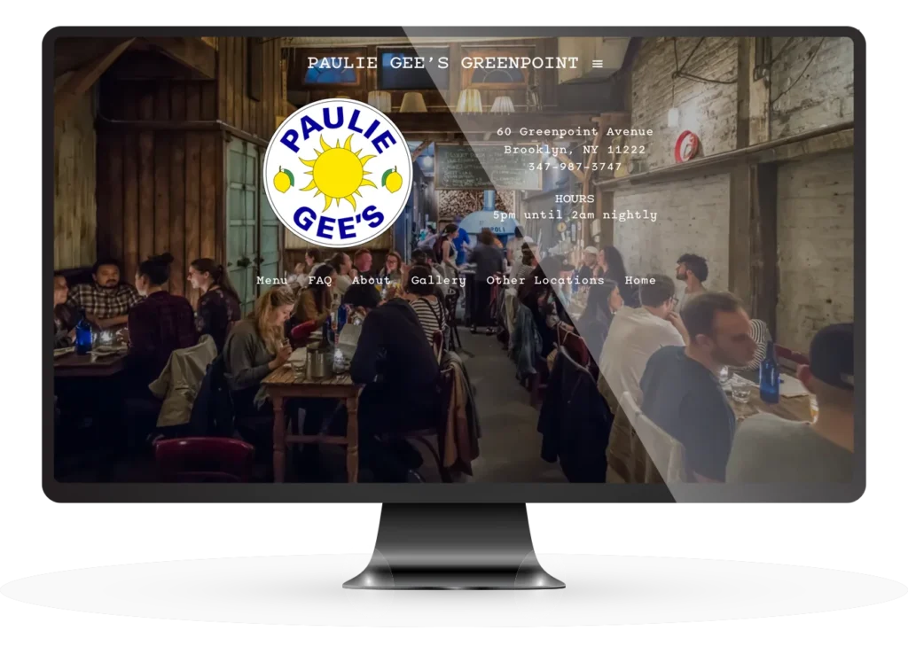
Updated look, new permissions for many editors.

Paulie Gees
Paulie Gees is an institution in Greenpoint, Brooklyn. The Wood Fired Restaurant is a sit down spot and the Slice Shop is just what it sounds like. There are also franchises in 5 other cities. They all share the same website, with each restaurant having it’s own page with it‘s own semi-unique menus, specials and announcements. Their old site was fairly old and not very user friendly. Worse, it was difficult to update. Each person had to put in change requests in a system that was not quick reacting and it was always a problem making minor updates.
Updated Design
Paulie Gee was happy with the original site design. We showed hom an option where adding images would liven up the pages as well as allow for each space to show its own unique style. When we showed him our concept he was sold as long as we used his typewriter font and background image which we incorporated seamlessly.
Unique Usage Requirements
Paulie Gee needed a better updating system. He also wanted each restaurant franchise to have full control over their own sites. By creating a new content type and user permissions based structure we were able to achieve everything he wanted, most importantly the ease of usage for all franchisees.
Project Scope
Paulie wanted to keep some of the design elements that he particularly liked, so we incorporated existing design elements into a new, modern website. Utilizing the typewriter font he favored, we set it for only headlines and headers, and used an easier to read sans serif font for the main copy. While keeping the beige table paper background, we added images, changed the way the menus worked and simplified the backend.
We created a permissions structure so each restaurant owner logs themselves in and can only edit their own restaurant (some franchisees own two). By leveraging ACF and Elementor Templates we created a unique Restaurant Content type which gave us the flexibility to tailor the information to fit their specific needs . By creating a flexible section of menu sections we allowed each restaurant to have different menu sections and the ability to add different menu items to it. Each section can be hidden as needed, menu items all have an 86 checkbox, so mangers can hide menu items as needed on the fly which is of extra importance since they use the web menu as their in house menu via a QR code.
In addition to that, we needed a way for each user to set up their own unique restaurant. This is extra important since all of the restaurants do not offer exactly the same thing, have different menus, hours and images. They created a new restaurant type where users can add their specific needs and menu items using a very simple form based input. And that we were able to add an 86 button to hide menu items that we run out of on the fly is a huge help, especially with automated phone orders.